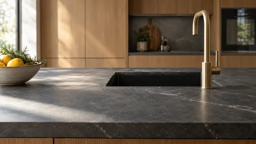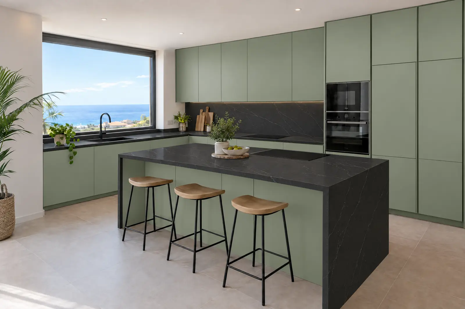
Choosing kitchen cabinet colours is more a matter of light and space than of taste. A green that looks perfect in the showroom can turn dull in a north-facing kitchen, and a matt black that looks elegant in a catalogue can make a small kitchen feel smaller. Before looking at samples, be clear about three things: how much light comes in, how big the kitchen is and which elements are staying.
First look at the light coming in
Natural light changes the colour of the units more than any other factor. A kitchen with plenty of light can take almost any shade; one with little light needs light or warm colours so it does not feel dark.
In Tenerife the difference between areas is marked. In the south, with strong sun almost all year round, bold colours look good, but doors next to a picture window get a lot of radiation: light lacquers can yellow and wood changes tone over the years. In the north, with more cloudy days and traditional houses with small windows, off-whites, light woods and soft greens give a warmer light than cool greys. Always look at samples inside your own kitchen, at different times of day.
White: the most versatile
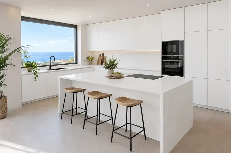
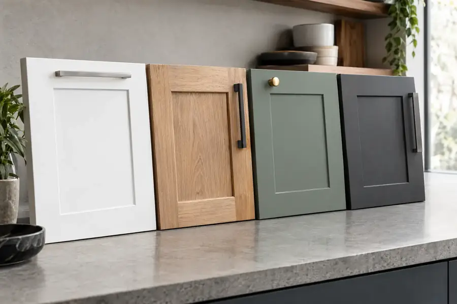
White works in small kitchens, dark kitchens and kitchens open to the living room, because it reflects light and does not compete with anything. It is also the easiest to combine with any worktop and floor.
Its drawbacks depend on the finish. Gloss white shows fingerprints and fine scratches in raking light; matt white hides them better, but in the most used areas it can collect dirt on the surface if the finish is not anti-fingerprint. An off-white or slightly warm white is more pleasant than pure white and ages better. The page about white kitchens shows common combinations.
Wood: warmth that does not date
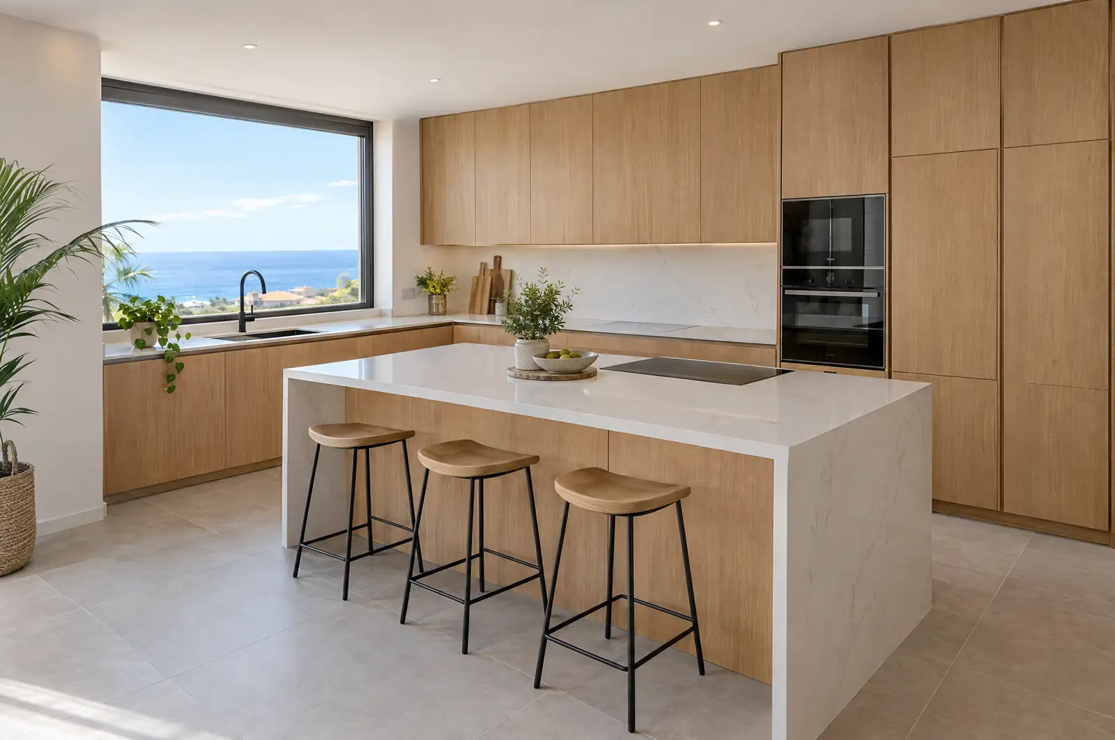
Wood, real or imitation, brings warmth and goes with almost everything, which is why it is so common as an alternative to white. Mid-oak tones work in both modern kitchens and traditional houses.
You have to choose between real wood and laminate. Natural veneer has more depth and can be repaired, but it changes tone with light. Today’s laminates imitate the grain very well, are more stable and cope better with humidity. A kitchen entirely in dark wood can feel heavy; combined with white above or with a light worktop, it balances out.
Green: the trend colour with the most staying power
Green has become common in kitchens in recent years, and in its muted shades (sage, olive, grey-green) it has plenty of staying power. It works well with wood, brass and white or black worktops.
Soft greens are bright and hold up well in medium-sized kitchens. Dark greens, such as bottle green, need a kitchen with good light and usually look best on the base units or the island, combined with light wall units. Bear in mind that green changes a lot with the light: the same door can look grey in the morning and deep green in the afternoon.
Grey and graphite: neutrals with nuances
Grey is a neutral that looks more current than white without the harshness of black. Light greys work almost like a white; graphites are already a statement colour.
The risk with grey lies in its temperature. A cool grey in a kitchen with little light can look gloomy; one with a warm base, closer to taupe or stone, feels more welcoming. Graphite looks especially good with white worktops and with wood, and it is a common choice in modern kitchens.
Black: elegant but demanding
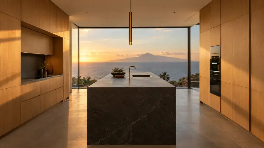
Black makes for very elegant kitchens, but it demands space, light and care. In a small kitchen or one with little natural light it closes in the space and absorbs artificial lighting.
In matt it shows fingerprints badly, unless the material is specifically anti-fingerprint. It works best as the main colour in open-plan, spacious and bright kitchens, or as an accent on an island or the base units. With a white or light stone worktop the contrast is very striking; with a black worktop and wood it is more understated.
What each colour needs
Each colour needs different light and space conditions, and this table sums up the points above so you can compare them at a glance:
| Colour | Light needed | Kitchen size | Maintenance | Goes well with |
|---|---|---|---|---|
| White and off-white | Any | Any, ideal in small ones | Gloss shows scratches; matt, dirt if not anti-fingerprint | Almost any worktop and floor |
| Wood | Any; natural veneer changes tone in the sun | Any | Laminate, minimal; veneer, varnish kept in good condition | White, stone grey or black worktops |
| Soft green | Medium or high | Medium or large | Normal | Wood, brass, white or black worktops |
| Dark green, graphite | High | Medium or large, best only on base units or the island | Normal | Light wall units, wood, white worktop |
| Grey | Medium or high, with a warm base if light is limited | Any | Normal | Wood and light worktops |
| Black | High | Large or open to the living room | Matt shows fingerprints | Light worktop or veined stone |
How to combine it with the worktop and floor
The practical rule is to look for contrast between units and worktop, and continuity between units and floor, or the other way round, but not to match all three. If everything is the same tone, the kitchen loses depth.
- Light units: can take dark, grey stone or veined worktops. With a light floor, a dark worktop keeps everything from looking flat.
- Wood units: look good with white, stone grey or black worktops. Avoid a floor wood that is very similar but not identical to the units, because the difference shows more than a clear contrast.
- Dark units: need a light or veined stone worktop, and a light or wood floor so the whole does not look dark.
If you are also changing the worktop, the guide to Silestone, Dekton, granite and porcelain helps you choose the material before the colour.
The size of the kitchen has the final say
In small kitchens, light colours and flat doors without visible handles make the space look bigger. A dark colour on the base units only anchors the kitchen without closing it in.
In large kitchens or those open to the living room there is more freedom, but the colour of the units becomes part of the living room. There it pays to think about the whole: floor, sofa, window frames. If your units are in good condition and you only want to refresh the colour, replacing the kitchen doors is a way to do it without changing the whole kitchen.